

Denmark SSI report week 2022-03
Danes disappear damaging data from the Statens Serum Institut weekly report

Previous posts in series: (2021) #49 | #51 | (2022) #01
This series graphs COVID-19 “vaccine” surveillance data from Denmark using the Danish Statens Serum Institut’s semi-regular Gennembruds-infektioner og vaccineeffectivitet report. The whole body of SSI reports can be found in their Arkiv. This post includes data from the SSI report for week 3 of 2022, which has data up to January 18.
Ch-Ch-Ch-Changes
I’m sorry this report is a few days late. The SSI has recently been publishing the report on a biweekly cadence every second Thursday, and their report for week 3 came out on January 20. Unfortunately, it seems someone in high authority has obviously decided that the efficacy calculations the Danes were putting out are too damaging to Pfizer, Moderna, and Big Pharma generally, and they have decided to drop the marquee feature of the report, from my perspective, which was the calculated “vaccine” efficacy against infection and hospitalization. My delay in publishing reflects some time spent thinking about whether the series can go forward without the efficacy data. On balance, I think it can. There is more damaging information in the Danish reports about the useless Science Shots, and I can continue to highlight it until they disappear it too!
In fairness to the Danes, let’s begin by showing you their excuse for spiking the most interesting part of the report, the part which just happened to be incredibly damaging to their snake oil injection narrative. On page 2, they offer us some Hovedpunkter:
Estimaterne af vaccineeffektiviteten (VE) mod covid-19-infektioner og covid-19-relaterede indlæggelser er ikke inkluderet i denne uges rapport. Dette skyldes at den seneste fire ugers periode ikke er sammenlignelig med de forrige opgørelsesperioder, hvor delta var den dominerende variant. Desuden udgør de uvaccinerede nu så lille en gruppe, at de ikke er sammenlignelig med de vaccinerede og derfor ikke kan bruges som referencegruppe i beregningen af VE estimaterne.
I am assured by the automated translation bot of a Very Evil search corporation that what these punks are saying in English is:
Vaccine efficacy (VE) estimates against covid-19 infections and covid-19-related admissions are not included in this week's report. This is because the last four-week period is not comparable with the previous inventory periods, where delta was the dominant variant.
In addition, the unvaccinated now constitute such a small group that they are not comparable with the vaccinated and therefore cannot be used as a reference group in the calculation of the RE estimates.
Got that? Because there’s a bit more of the Megatron variant this week and a bit less Delta, we can’t compare anything anymore. You can’t compare Megaron with Delta, except you sometimes can, but only if the mix is just so. Also because in two weeks there has been a 1 point increase (from 77% to 78%) in the total number of Double Plus Unvaccinated members of Danish society, we also can’t compare numbers anymore.
Now that you understand that, dear reader, you can see that all these deletions have nothing, I repeat nothing, to do with the fact that last week they were showing the two-dose course of Pfizer Health Sauce as being negative forty percent effective against infection for those 65+, and the two-dose course of magic Moderna Unicorn Juice as being negative thirty percent effective for the same age group, having dropped 60 points over the preceding two weeks. Nothing to do with that. Oh, also another thing it has nothing to do with is the fact that our friends at Statens Serum Institut want to continue making this this claim at the beginning of their reports (bold added by me):
Vaccinations are an important and effective tool for preventing and limiting the incidence of disease. The effectiveness may vary between the different vaccines, and no vaccine is 100% effective in preventing infection. The efficacy of COVID-19 vaccines is generally high, especially in terms of protection against serious illness, hospitalization and death.
Allowing those charts with that claim is, to be sure, a little on the incongruous side, but I’m sure they didn’t just delete the charts so they could keep the claim.
Well with all that said, let’s move on to see what we can learn from the report.
Context
The value of our contextual charting is reduced by the removal of the efficacy data, as the data in the redacted tables also drove the graphs of infections by dose number and hospitalizations by dose number. We are left with the population vaccination graph:

In the above graph you can see that after a slow start vis-à-vis the UK, the Danes are now boosting the hell out of their people at a higher rate than are the United Kingdominians. (I will put out the latest UKHSA vaccine surveillance report data as soon as I can—it is also delayed as I try to sort out how to deal with recent removals of critical data.) Denmark has now surpassed the UK in terms of number of suckers boosted as a percent of the total population, and the boosting rate over the two week period from week 1 to week 3 is about 5% of total population per week, whereas the UK is down below 1% per week and dropping fast.
Because the variant mix tables are not very interesting with respect to the efficacy of the injectable pharmaceutical products, the Danes have left those tables intact, giving us our four variant graphs below. We see that the Megatron variant has finally surpassed Delta in Denmark (top left chart, New Infections by Variant) and that the boosters are already starting to fail massively with regard to Omicron (bottom right chart, Dose 3 Breakthrough Infections by Variant).


Efficacy
It is the efficacy section that the Danish bureaucrats have really sought to stymie with their disappearing data trick. However despite their best efforts, there remains a table that is absolutely calamitous for the Safe and Effective injection narrative, if you take a second to think about what it means. In future weeks, I will re-comb the old reports and convert the data in this table into a time series, so we can look at graphs going forward. For this week, it is tables.
The SSI report contains a table (which I have highlighted previously, in week 51), showing the total percentage of people considered “vaccinated” (according to the pfraudulent definition of the pharmaceutical merchants) who subsequently tested positive for the coof. For those of you who have followed the pfraud carefully over the past two years of insanity, you know that the number of people the bureaucrats count as infected is precisely those who took a test and had a positive result, which is likely to be substantially less than the total number of people infected, since many people have few symptoms, or are lazy, or are too wise to ruin their lives by foolishly informing the state of their condition. So the percentages in this table are certainly a floor.
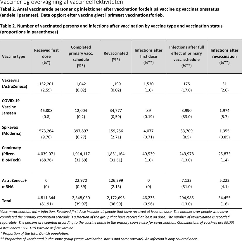
Here is the table from last week’s report (week 1 of 2022). The columns you are interested in are the last two, which show the percentage of breakthroughs after dose 2 and dose 3, respectively. Even last week, this table was already a disaster.
Fast forward to this week, as shown below with the deltas conveniently annotated on courtesy of my supercomputergraphiks skills.
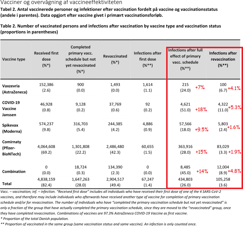
Look at Pfizer, for example, which saw breakthrough infections jump 15 points for double-injected people in a two week period.
If you look at the note beside the double asterisk, you can plainly see that that we can (and really must) sum the two columns to get the percentage of the “vaccinated” population of injected sheep, having had at least 2 and possibly 3 official doses, who have had a breakthrough infection. For Pfizer, this number is, so far, 31.3%. In other words, nearly one in every 3 people who was declared “fully vaccinated with Pfizer” (and even possibly declared “fully boosted”) in Denmark subsequently got infected with the Rona.
This is an epic failure.
Would you give your kid three-shot course of vaccination for polio if you were told that within a six month period from the first shot, he had a one in three chance of developing polio anyway?
A stunning failure.
Our Danish friends are trying to hide it by deleting their calculated efficacy percentages, and by mumbling some Sciencey Sounding words about why all of a sudden this week the numbers can’t be compared anymore.
Do you believe them?
I suspect that Denmark opening up their country is a distraction so that they can confound the data even more? Let life get back to “normal” and hopefully people will forget the excess mortality? And there will be so many more variables by people traveling, going to work, tourism etc.
Very good find. It's actually surprising that they included directly falsifying data in their reports as long as they did. Maybe there was a "good guy" in the department who has recently received their notice of termination.